Clients rarely hire a lawyer from the website alone, but they rule firms out because of it. Before anyone calls, they check whether the firm looks established, handles their kind of matter and feels safe to contact. These are the patterns we see on law firm websites that pass that test, with an example from our own work.
What a law firm website has to do
A law firm site has three jobs, in this order:
- Earn trust in seconds. Design quality is read as a sign of how the firm works.
- Show the right expertise. A company looking for a commercial lawyer wants to see commercial work, not a list of everything the firm does.
- Make contact feel safe. Legal enquiries are sensitive. The path to a consultation should be short and discreet.
7 design patterns from law firm websites that win clients
1. A homepage that says who you serve, in one line
The best firm homepages open with a plain statement: the kind of client, the kind of law and the place. “Commercial law firm for companies in Saudi Arabia” does more work than “Excellence in legal services”.
2. One page per practice area
Clients search for their problem, such as “employment lawyer Riyadh” or “company formation lawyer Dubai”. A single “Services” page can’t rank for all of them. Give each practice area its own page with the questions clients ask, the work you handle and who leads it.
3. Lawyer profiles that read like credentials
Each lawyer page should show qualifications, bar admissions, languages, practice areas and notable work. Add Person schema so Google connects the lawyer to the firm.
4. Proof without breaking confidentiality
You often can’t name clients. You can show sectors served, types of transactions, publications, rankings and memberships. Specific, checkable facts beat adjectives.
5. A consultation request that feels private
Ask only for name, contact details and a short description. Say who will read it and how fast you reply. In the Gulf, a WhatsApp option often gets more enquiries than a form.
6. Arabic and English at the same standard
If your clients read Arabic, the Arabic version is not a translation job. It needs a right-to-left layout, Arabic typography and its own SEO. A weak Arabic site tells local clients the firm cares less about them.
7. An insights section that answers real questions
Short articles on regulation changes and common client questions build authority and bring in search traffic that a static brochure site never gets.
Example: Alnowaiser, a commercial law firm in Riyadh
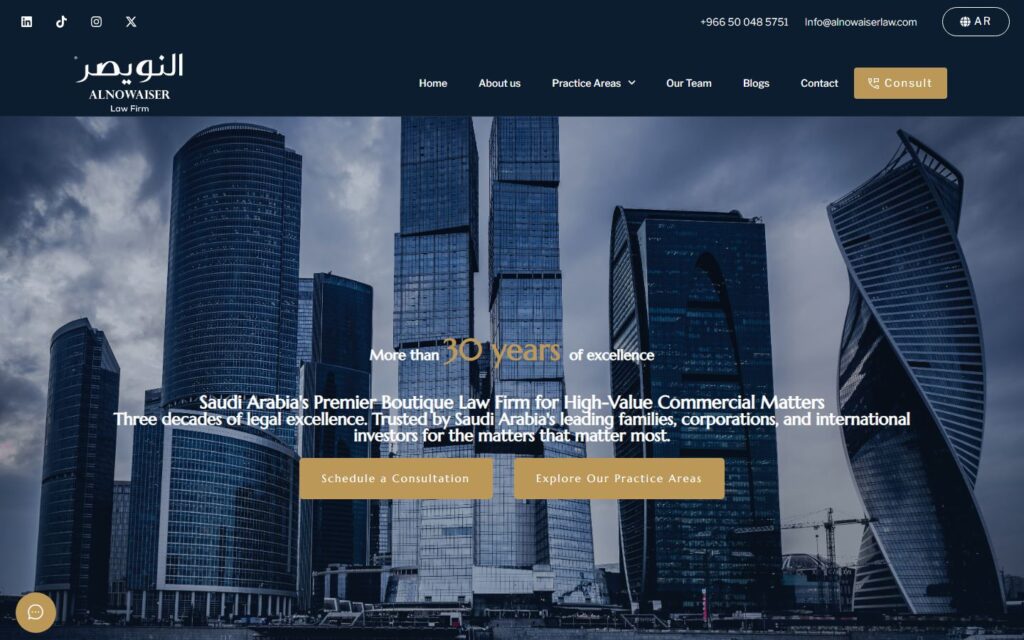
Alnowaiser is a commercial law firm in Riyadh. We designed and built their website in Arabic and English, with both languages held to the same standard: proper right-to-left layouts, matching typography and separate pages for each language.
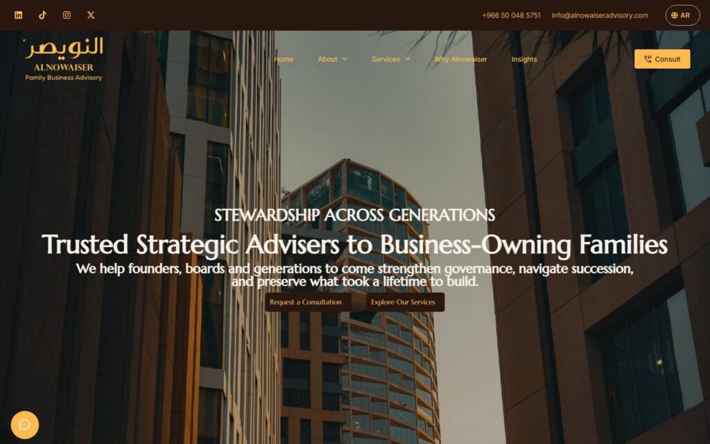
The structure follows the patterns above: a direct homepage message, practice areas laid out for the firm’s commercial clients, and a calm, editorial design that looks as serious as the firm’s work. We later built the website for Alnowaiser Advisory, the group’s strategic advisory firm, on the same principles.
Practice area pages, lawyer profiles and bilingual sites built to win consultations.
Common mistakes on law firm websites
- Gavels, scales and handshakes. Generic stock photos make every firm look the same.
- One page for every service. It can’t rank, and it hides your depth.
- Slow pages. Heavy themes and sliders lose mobile visitors before the page loads.
- Long contact forms. Asking for case details up front scares people off.
- Machine-translated Arabic. Native readers notice in one sentence.
Checklist before you brief a web designer
- List your practice areas and pick the ones you want more work in.
- Collect lawyer bios, qualifications and photos.
- Decide on languages, and who will write or review the Arabic.
- Gather proof you can publish: sectors, rankings, publications.
- Decide how enquiries should reach you: email, WhatsApp or a booking calendar.
With those ready, a designer can quote accurately and the build moves fast. If you want a fixed quote, send us a short brief.